Simulating a model with basico
First some jupyter magic for plotting and convenience
[1]:
%pylab
%matplotlib inline
import sys
if not '../..' in sys.path:
    sys.path.append('../..')
Using matplotlib backend: Qt5Agg
Populating the interactive namespace from numpy and matplotlib
Now import basico
[2]:
from basico import *
now we are ready to load a model, just adjust the file_name variable, to match yours. The file can be a COPASI or SBML file. For this example, we use the brusselator model, that is distributed with the package.
[3]:
file_name = get_examples('brusselator')[0]
[4]:
model = load_model(file_name)
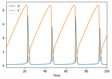
now we are ready to simulate. Calling run_time_course will run the simulation as specified in the COPASI file and return a pandas dataframe for it.
[5]:
run_time_course().head()
[5]:
| X | Y | |
|---|---|---|
| Time | ||
| 2.0 | 0.345934 | 2.368188 |
| 2.5 | 0.182762 | 2.658596 |
| 3.0 | 0.147433 | 2.863681 |
| 3.5 | 0.141129 | 3.048319 |
| 4.0 | 0.140734 | 3.228345 |
for plotting you would then just plot that as one does
[6]:
df = run_time_course()
df.plot()
[6]:
<AxesSubplot:xlabel='Time'>

The run_time_course command
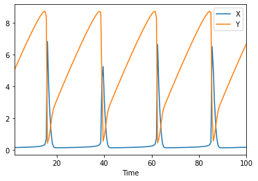
you can change different options for the time course by adding named parameters into the run_time_course_command. Supported are:
model: incase you want to use another model than the one last loadedscheduled: to mark the model as scheduledupdate_model: to update the initial state after the simulation is runduration: to specify how long the simulation is runautomatic: in case you would like automatic step size being usedoutput_event: in case you would like to have the event values before and after the event hit listedstart_time: to change the start timestep_numberorintervals: to overwrite the number of steps being usedmethod: a method name to use for the simulation.
so lets run two simulations that will be different slightly, as we will use the update_model flag:
[7]:
df1 = run_time_course(update_model=True)
df2 = run_time_course(update_model=True)
[8]:
df1.plot(), df2.plot()
[8]:
(<AxesSubplot:xlabel='Time'>, <AxesSubplot:xlabel='Time'>)
And now you could plot the difference between them too:
[9]:
(df1-df2).plot()
[9]:
<AxesSubplot:xlabel='Time'>
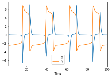
[10]:
(df1-df2).describe()
[10]:
| X | Y | |
|---|---|---|
| count | 197.000000 | 197.000000 |
| mean | -0.014562 | -0.123916 |
| std | 1.592729 | 3.615933 |
| min | -6.630084 | -3.816620 |
| 25% | -0.056936 | -2.428037 |
| 50% | -0.024780 | -2.245888 |
| 75% | 0.077394 | 4.837513 |
| max | 7.051794 | 6.844179 |
[ ]: